Data Processing
2. missing data를 로우(axis=0) 단위로 자체(inplace=True)에서 삭제하고 확인하기
3. 불순 데이터(엉터리 데이터 = 같은 형타입이 아닌) 삭제
Feature Engineering
3. Purchse Address 를 주소, 시, 주, 우편번호로 분리
Sales 분석
Sales data 불러와서 DataFrame구성
|
import pandas as pd
import numpy as np
import os
files = ["April_2019.csv","August_2019.csv","December_2019.csv","February_2019.csv","January_2019.csv",
"July_2019.csv","June_2019.csv","March_2019.csv","May_2019.csv","November_2019.csv", "October_2019.csv","September_2019.csv"] filenames = [ url + file + "?raw=true" for file in files]
All_data = pd.DataFrame()
for file in filenames:
df = pd.read_csv(file, engine='python',on_bad_lines='skip')
All_data = pd.concat([All_data , df])
data = All_data
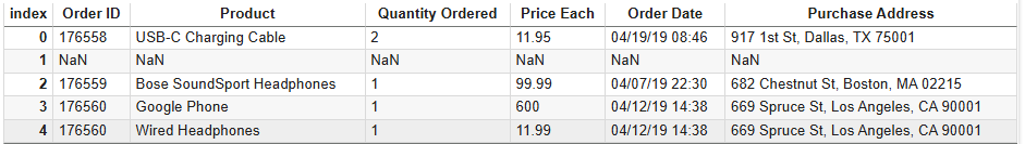
data.head()
# random 표시 # data.sample(5) |
|
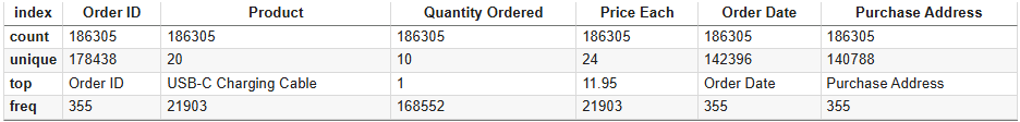
data.describe()
data.shape |
(186850, 6)
Data Processing
1. missing data 찾기
|
data.isna().sum()
|

|
data[data.isna().any(axis = 1)]
|

2. missing data를 로우(axis=0) 단위로 자체(inplace=True)에서 삭제하고 확인하기
|
data.dropna(axis=0, inplace=True)
data.isna().sum() |
3. 불순 데이터(엉터리 데이터 = 같은 형타입이 아닌) 삭제
|
data[data['Order Date'] == 'Order Date']
|

이들을 제거하는 가장 좋은 방법은 각 칼럼을 형변환을 할시 errors="coerce" 옵션을 해주면 변환에 실패한 값들은 자동으로 Nan 이 되므로 다시한번 2의 dropna 를 해주면 된다.
|
data['Quantity Ordered'] = pd.to_numeric(data['Quantity Ordered'], errors='coerce')
data['Price Each'] = pd.to_numeric(data['Price Each'], errors='coerce') data['Order Date'] = pd.to_datetime(data['Order Date'], format='%m/%d/%y %H:%M' , errors='coerce') data.dropna(axis=0, inplace=True) |
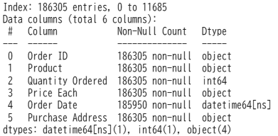
칼럼의 형 정보를 살펴보자
|
data.info()
|
4. 중복된 data 보기
|
data.duplicated().sum()
print(data[data.duplicated() == True]) |
Feature Engineering
1. 주문당 구매액( Total ) 생성
|
data['Total'] = data['Quantity Ordered'] * data['Price Each']
|
2. Order Date 를 월일시로 분리
|
data['month'] = data['Order Date'].dt.month_name()
=> January Februry March ... data['day'] = data['Order Date'].dt.day_name() => Sunday Monday Tuesday ... data['hour'] = data['Order Date'].dt.hour
=> 0 1 .. 23 |
3. Purchse Address 를 주소, 시, 주, 우편번호로 분리
|
data[['Street Address', 'City', 'State ZIP']] = data['Purchase Address'].str.split(', ', expand=True)
|
※ 'State ZIP'을 다시 'State'와 'ZIP'으로 분리하고자 하기 때문에 expand=True 를 추가하자.
그러면 분리값이 One Dimension( [XXX, YYY, ZZZ] ) 대신에 추가로 분리가 가능한 Multi Dimesion으로 구성된다.
4. State 와 ZIP 으로 재 분리
|
data[['State' , 'Zip']] = data['State ZIP'].str.split(' ',expand = True)
|
5. 불필요한 칼럼들 삭제
|
data.drop(['Purchase Address' , 'State ZIP'] , axis = 1 ,inplace = True)
# or data.drop(columns = ['Purchase Address' , 'State ZIP'], inplace = True)
|
6. Order Date 순으로 정렬
|
data = data.sort_values(by='Order Date')
|

Sales 분석
1. 매출액이 가장 큰 달은?
먼저 month로 그룹핑을 하고 그 그룹의 Total의 sum ※ as_index=False 를 하지 않으면 month 가 index가 됨
|
monthly_sales = data.groupby(['month'] , as_index = False)['Total'].sum()
# = monthly_sales = data.groupby(['month'] , as_index = False).agg({'Total': 'sum'}) |
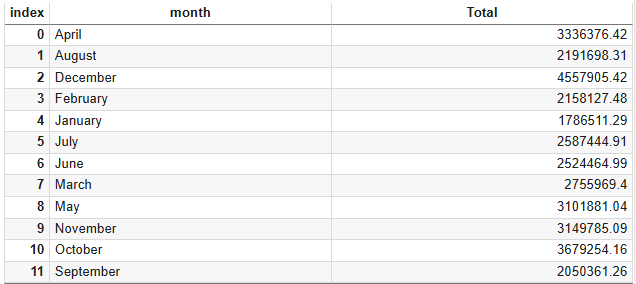
위를 보면 알파벳순으로 되어 있기에 1월부터 순서대로 그래프로 보기 위해 아래와 같이 정렬 처리
|
month_dict = {
'January': 1, 'February': 2, 'March': 3, 'April': 4, 'May': 5, 'June': 6,
'July': 7, 'August': 8, 'September': 9, 'October': 10, 'November': 11, 'December': 12
}
monthly_sales.sort_values(by='month' , key = lambda x : x.apply(lambda y : month_dict[y]) , inplace = True)
# 혹은 다음도 가능 # monthly_sales['month'] = pd.Categorical(monthly_sales['month'], categories=month_dict, ordered=True) # monthly_sales.sort_values('month', inplace=True)
|
※ x : monthly_sales['month'], y : x 의 values 즉 1, 2, 3 .. 으로 정렬

그래프로 표시 (DataFrame.plot.bar 로 가능하나 좀 더 세련된 그래프를 위해서 seaborn을 사용하자.)
|
import seaborn as sns
import matplotlib.pyplot as plt
import matplotlib.ticker as mtick
plt.figure(figsize=(12 , 5)) # inch
ax = sns.barplot(data = monthly_sales , x = 'month' , y = 'Total' , color = 'orange' )
ax.yaxis.set_major_formatter(mtick.FuncFormatter(lambda x, pos: f'{x / 1e6:.0f}M'))
# 혹은 아래와 같이 # func = lambda x, pos: f'{x / 1e6:.0f}M'
# ax.yaxis.set_major_formatter(func)
# plt.show()
plt.title('Total Sales by Month')
plt.xticks(rotation=45)
plt.show()
|

2. 각 달의 요일별 주문수는?
|
day_data = data.groupby(['month' , 'day'],as_index = False).agg({'Total' : 'sum', 'Order ID':'count'})
# Order ID 칼럼은 본래의 의미가 아니므로 칼럼명을 변경
day_data.rename(columns={'Order ID': 'Orders'}, inplace=True)
|
month로 그룹핑이 되고 그 다음 day 별로 Total, Order ID 칼럼으로 집합을 구하는데 sum과 count 메서드를 사용
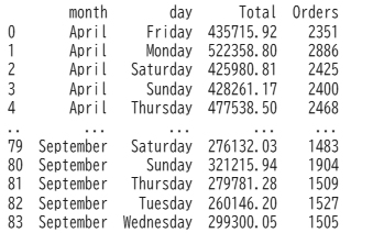
month -> day 별로 소팅
|
month_dict = { 'January': 1, 'February': 2, 'March': 3, 'April': 4, 'May': 5, 'June': 6,
'July': 7, 'August': 8, 'September': 9, 'October': 10, 'November': 11, 'December': 12 }
day_data['month'] = pd.Categorical(day_data['month'], categories=month_dict, ordered=True) day_data['day'] = pd.Categorical(day_data['day'], categories=day_dict, ordered=True)
day_data.sort_values(by=['month', 'day'], inplace=True)
|

|
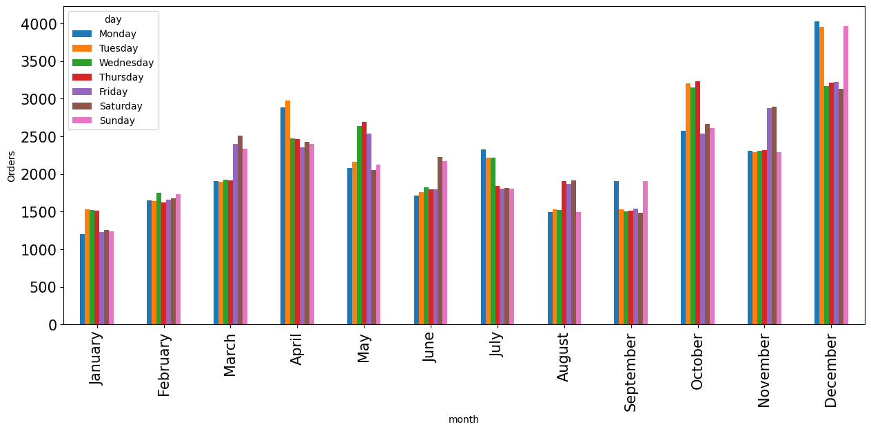
day_data_order = day_data.pivot_table(index = 'month' , values = 'Orders',columns='day' )
day_data_order.plot(kind = 'bar',figsize = (15 , 6) , fontsize = 15,ylabel = "Orders")
|
|
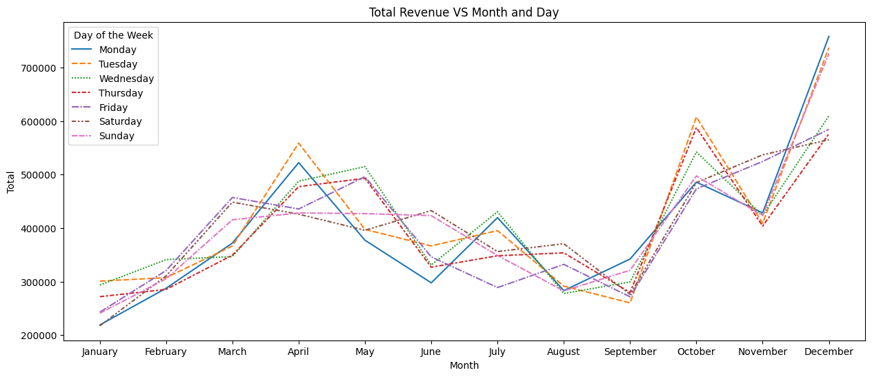
day_data_Total = day_data.pivot_table(index = 'month' , values = 'Total',columns='day' )
plt.figure(figsize=(15, 6)) # inch sns.lineplot(data=day_data_Total)
plt.title('Total Revenue VS Month and Day')
plt.xlabel('Month')
plt.ylabel('Total')
plt.legend(title='Day of the Week', loc='upper left')
plt.show()
|
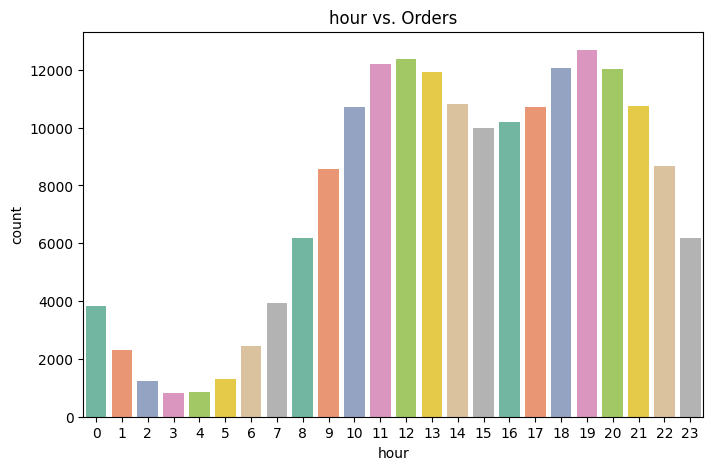
3. 시간대별 주문수는?
|
plt.figure(figsize=(8,5))
plt.title('hour vs. Orders')
sns.countplot(x='hour', data=data, hue=data['hour'], legend=False, palette = "Set2")
|
4. 가장 많이 팔린 제품은?
|
product_order_counts = data.groupby(by='Product', as_index=False).agg({ 'Quantity Ordered': 'sum'})
plt.figure(figsize=(10,5))
sns.barplot(x='Product', y='Quantity Ordered', data=product_order_counts, hue=product_order_counts['Product'], legend=False, palette='Set2')
plt.title('Sales count per Product')
plt.xticks(rotation=90)
plt.show()
|

5. 각 도시별 Top5 판매수 제품들은?
|
Cities_Products = data.groupby(['City', 'Product'] , as_index=False).agg({'Quantity Ordered' : 'sum', 'Total':'sum'})
Cities_Products.rename(columns = {'Quantity Ordered':'orders_count'}, inplace = True)
Cities_Products = Cities_Products.groupby(['City'] , group_keys = False).apply(lambda x: x.nlargest(5, 'orders_count'))
x = Cities_Products.pivot_table(index = 'City' , values ='orders_count',columns = 'Product' )
x.plot(kind = 'bar' , figsize=(12,7))
plt.ylabel('Total Orders')
plt.title("Top 5 Products for each City")
|

6. 주문당 구매 제품수의 정보는?
|
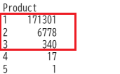
# 같은 Order ID 로 구매한 Product의 수
Products = data.groupby('Order ID')['Product'].count() Products = Products.value_counts()
Products = Products.nlargest(3)
|
|
colors = ['#ff9999', '#66b3ff', '#99ff99']
explode = [0.3,0.3,0.5]
plt.figure(figsize=(8, 8))
plt.pie(Products, labels=Products.index, colors=colors, autopct='%1.1f%%', startangle=180,explode = explode)
plt.title("percentage of orders include multiple products")
plt.show()
|

7. 최대 구매액은?
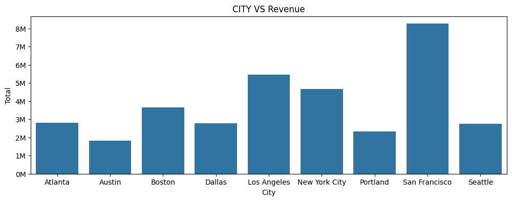
8. 도시별 구매액은?
|
Cities_orders = data.groupby(['City'], as_index=False).agg({'Order ID' : 'count','Total':'sum'})
Cities_orders.rename(columns = {'Order ID':'orders_count'}, inplace = True)
|

|
plt.figure(figsize=(12 , 4))
ax = sns.barplot(data = Cities_orders, x = 'City' , y = 'Total')
ax.yaxis.set_major_formatter(mtick.FuncFormatter(lambda x, pos: f'{x / 1e6:.0f}M'))
plt.title("CITY VS Revenue")
plt.show()
|
9. 주별 주문수의 분포는?
|
states = data['State'].value_counts()
colors = ['#ff9999', '#66b3ff', '#99ff99', '#ffcc99', '#c2c2f0','#fd9901', '#ffb3e6', '#c6e2e9']
explode = [0.1,0.1,0.1,0.1,0.1,0.1,0.1,0.1]
plt.figure(figsize=(8, 8))
plt.pie(states, labels=states.index, colors=colors, autopct='%1.1f%%', startangle=140,explode = explode)
plt.title("Distribution of Orders by State")
plt.show()
|

'data science > pandas' 카테고리의 다른 글
| index 처리 (0) | 2025.03.14 |
|---|---|
| 복수의 DataFrame들을 수직방향으로 통합하기 (0) | 2025.03.12 |
| 두개의 Series를 하나의 DataFrame으로 통합 (0) | 2025.03.12 |
| (pandas) basic (0) | 2024.10.23 |
| (pandas) Youtube 노빠꾸탁재훈 채널 분석 (0) | 2023.11.18 |